MicroStrategy Version 10
2012 - 2014 | Lead UX Designer
MicroStrategy version 10 provides a fast and intuitive analytics experience across web, desktop, and mobile interfaces. It is MicroStrategy's first attempt at the self-service BI product.
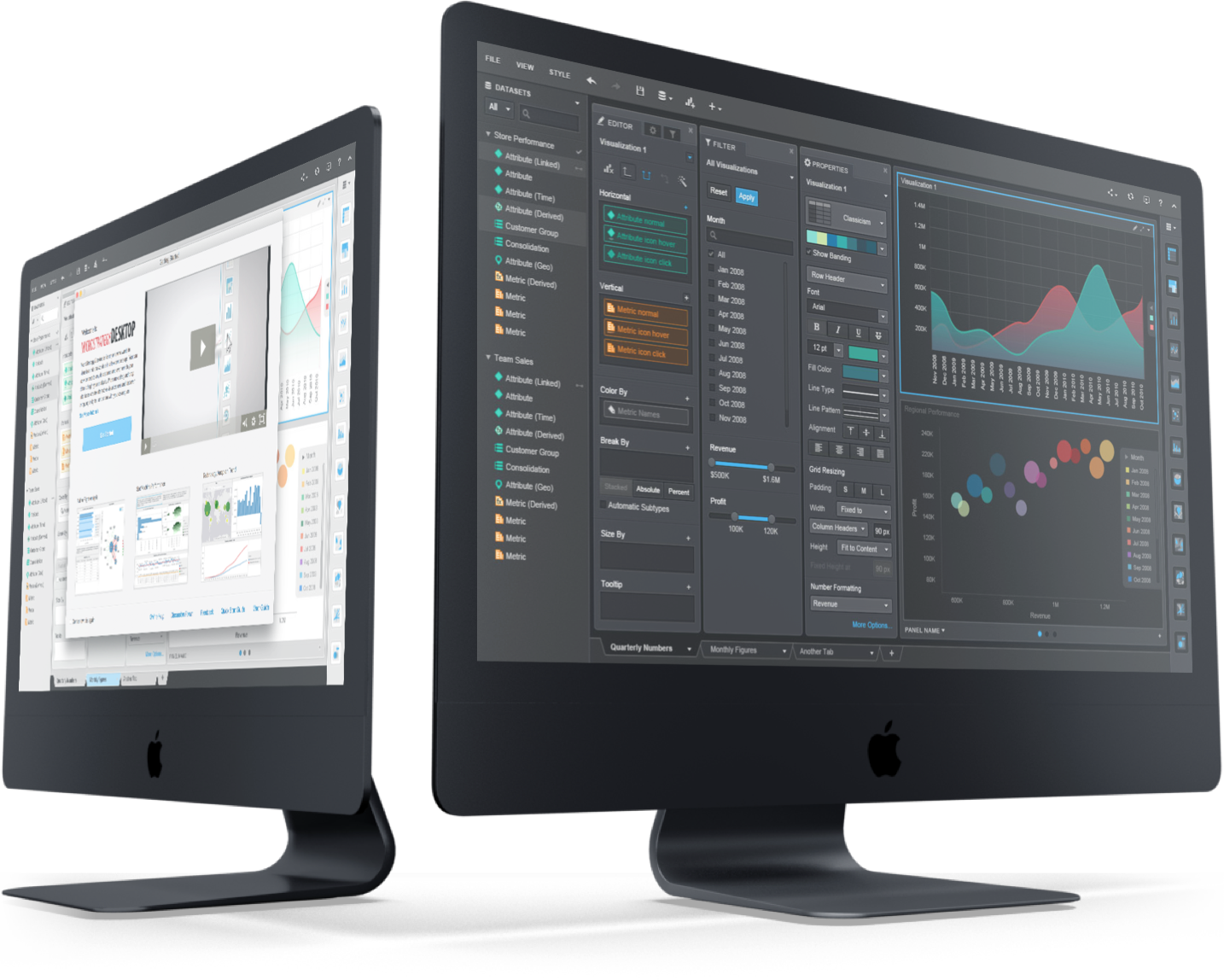
The future is data discovery
Version 10, the first self-service platform from MicroStrategy Inc.
Traditional business intelligence (BI) and analytic models are being disrupted as the balance of power shifts from IT to the business, according to Gartner, Inc.
The industry is moving towards data discovery/self-service model, which will reduce complexity in preparing and exploring data. MicroStrategy’s existing products back then is the MicroStrategy 9 suite, which is a traditional IT-centric BI platform. It is not very user-friendly, and it requires professional BI consultants to set up and maintain. It is especially difficult to use when handed over to non-power users.
The new product needs to cover most of the feature sets of its predecessor, while also shift to a self-service data integration and exploration model.
Persona
The new product needs to offer a rich feature set for power users, while also create an intuitive and easy to use package for the non-power users.

Data analyst
Jason is a professional data analyst. He accesses database on a daily basis.
- Data integration is time-consuming;
- Creating a data report/dashboard can be complex;
- Need to communicate with data consumer frequently.

Sales manager
Gary is a sales manager. He monitors the sales performance of the team frequently using a data visualization dashboard provided to him.
- He has limited database related knowledge; can not access the database directly;
- He can not modify a data dashboard on the fly;
- He can not explore data in a self-service way.
Information architecture
The previous version of the MicroStrategy application has a counter-intuitive IA model. It was designed based on a development priority rather than a user-centric perspective.
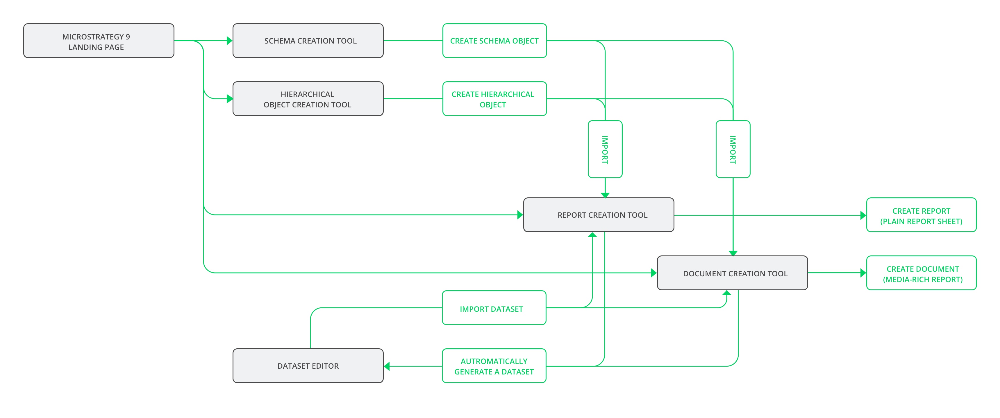
Information architecture
In version 9, users need to use different tools to create components, then pull all these components together to create a data report. As a result, user wastes a lot of time navigating through all these interfaces/tools.

IA model of the version 10 new design
We have streamlined the workflow for the new product. Users now only need to access to one interface. The all-in-one interface consists of a data source window and a dashboard worksheet area.
Design proposal
Easy to use
The application needs to be easy and friendly for the non-power users. At the same time, it also needs to offer a rich and advanced feature set for the power users.
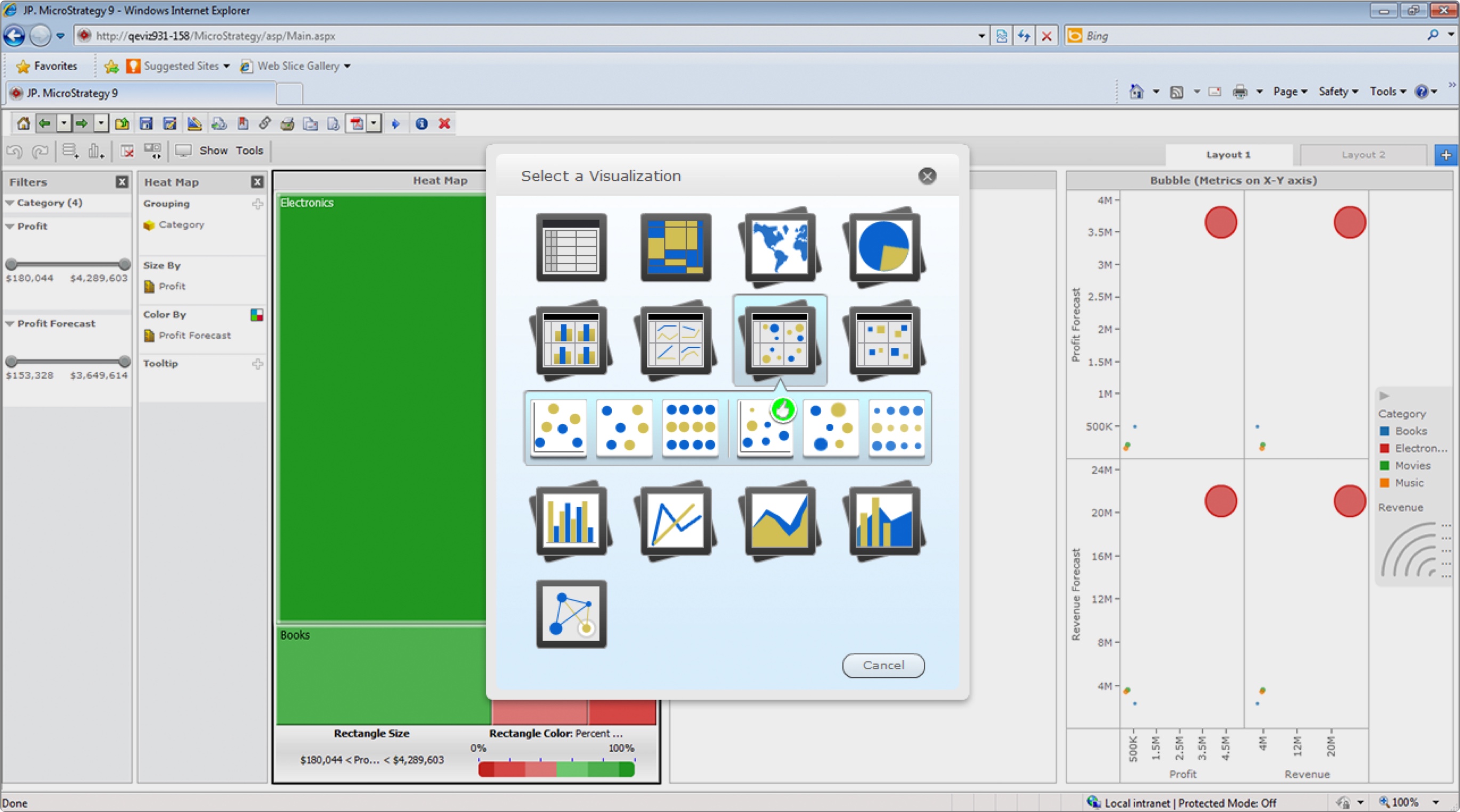
In version 9, when building a visualization, users need to choose one visual type out of more than 20 different types. For non-power users, it ‘s hard to identify different sub-types by the thumbnail icons.
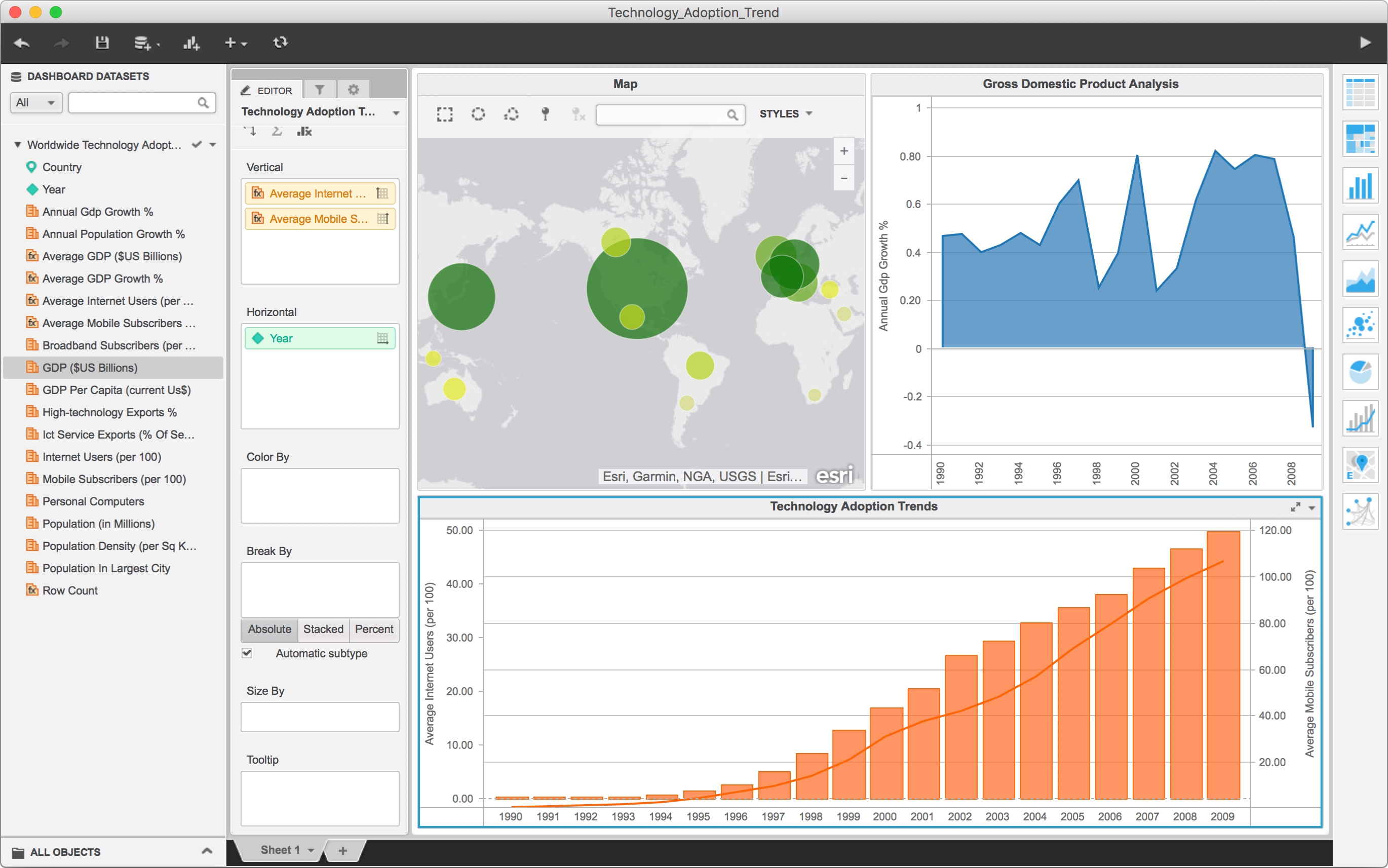
We try to simplify the UI and make the UI self-explanatory for the new product. Reducing cognitive load is one of the approaches: We successfully reduced the selection of visual types to 10. The application will automatically select the best sub-type for the user. In the meantime, power users can still manually choose different subtypes using the EDITOR panel.
Scalable and flexible interface
Most of the BI applications on the market share a similar interface: The interfaces all consist of control panels and a visualization canvas. The layout of the interfaces are quite different though: Eg. some application place the filter controls on the bottom, some on the right side. Here are several typical layouts of BI application, control panel marked in darker gray color, visualization canvas in a lighter color.


In the end, we decided to build a fully customizable interface, which allows users to change the layout of the interface based on their use cases or habits.
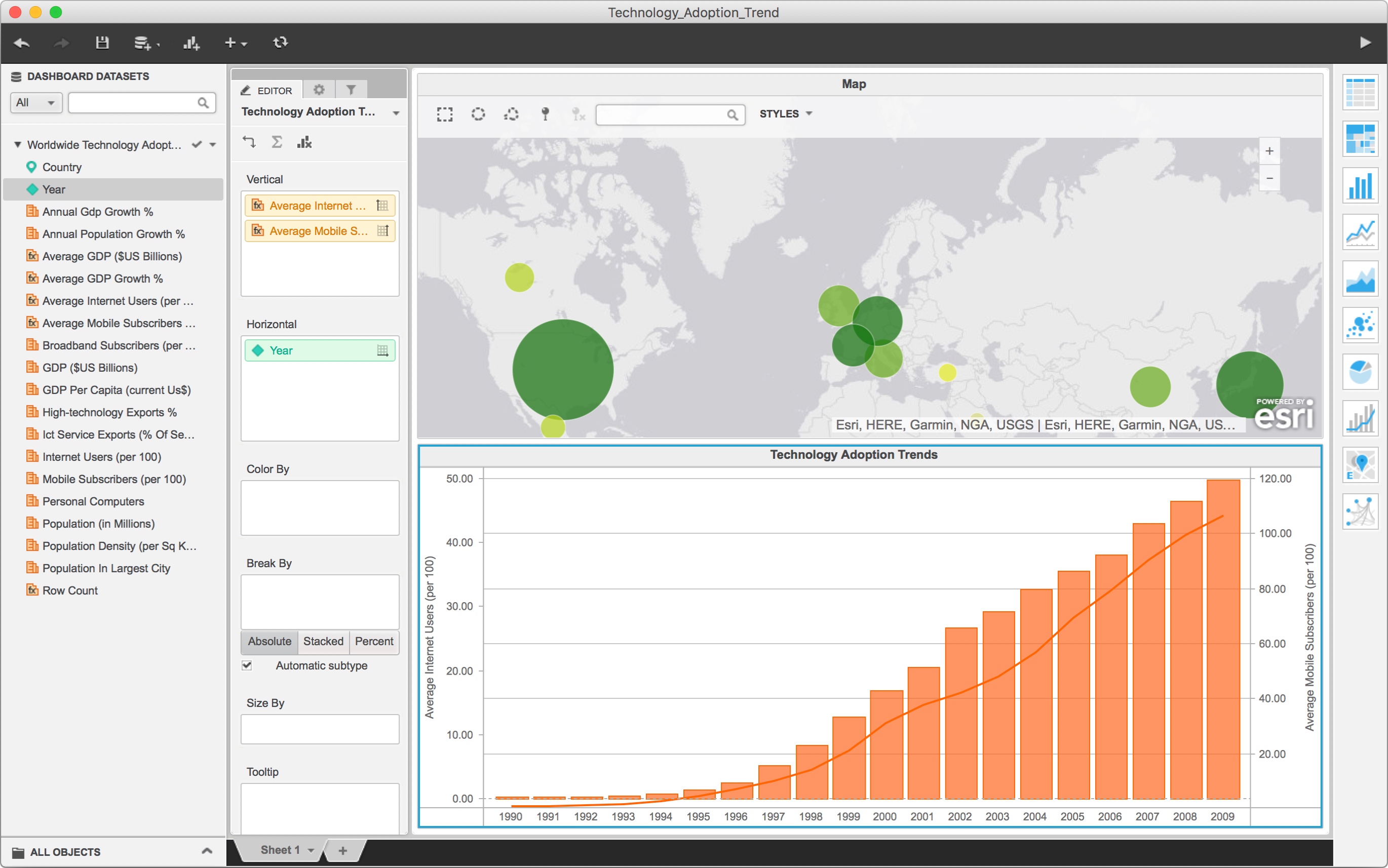
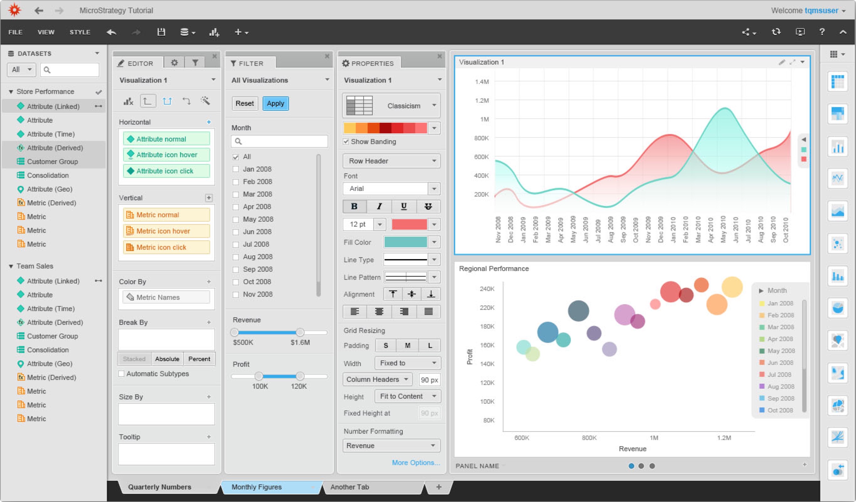
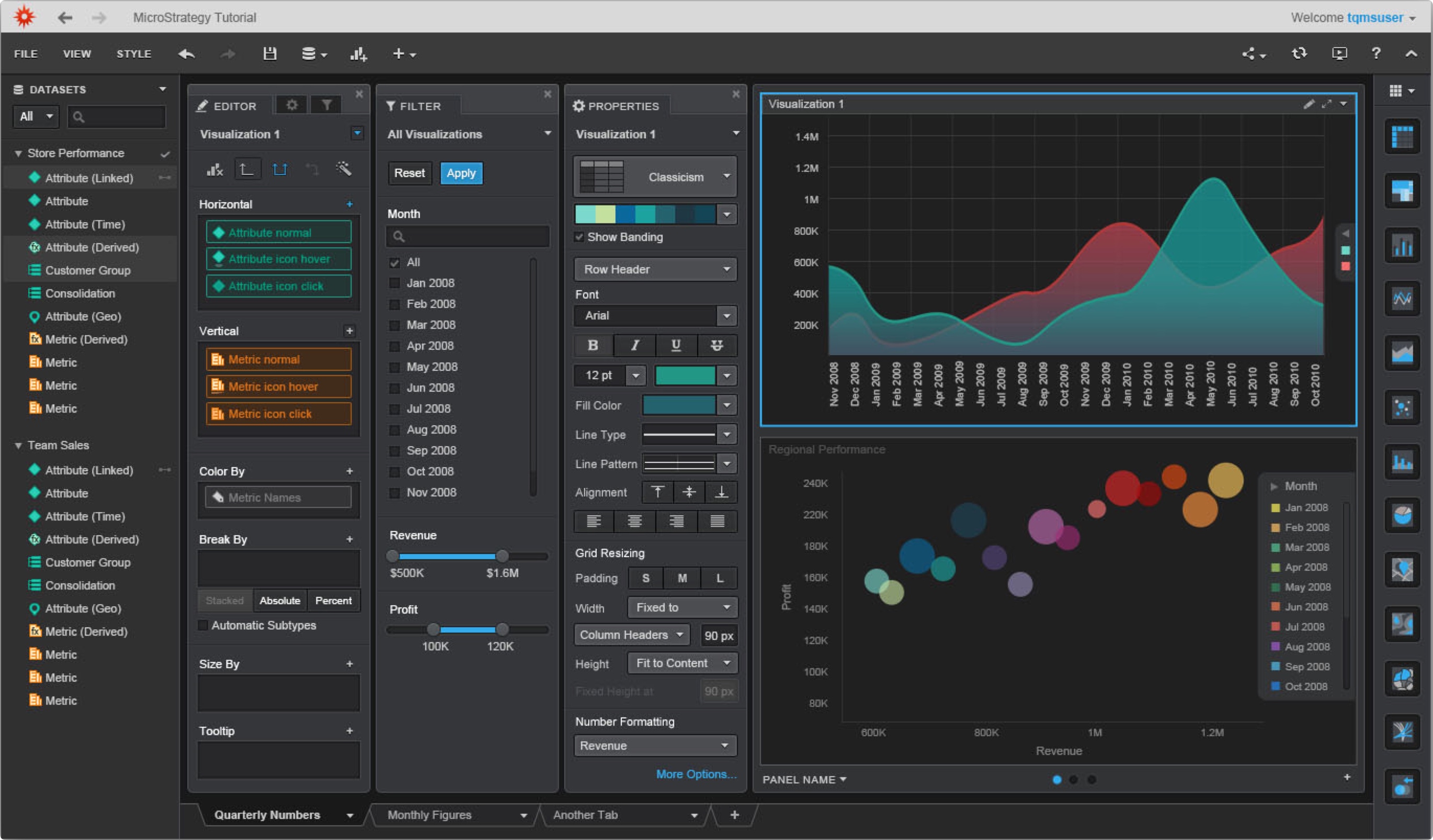
The default view has EDITOR, PROPERTIES, and FILTER panels all docked together. For non-power users, only the EDITOR panel is essential.
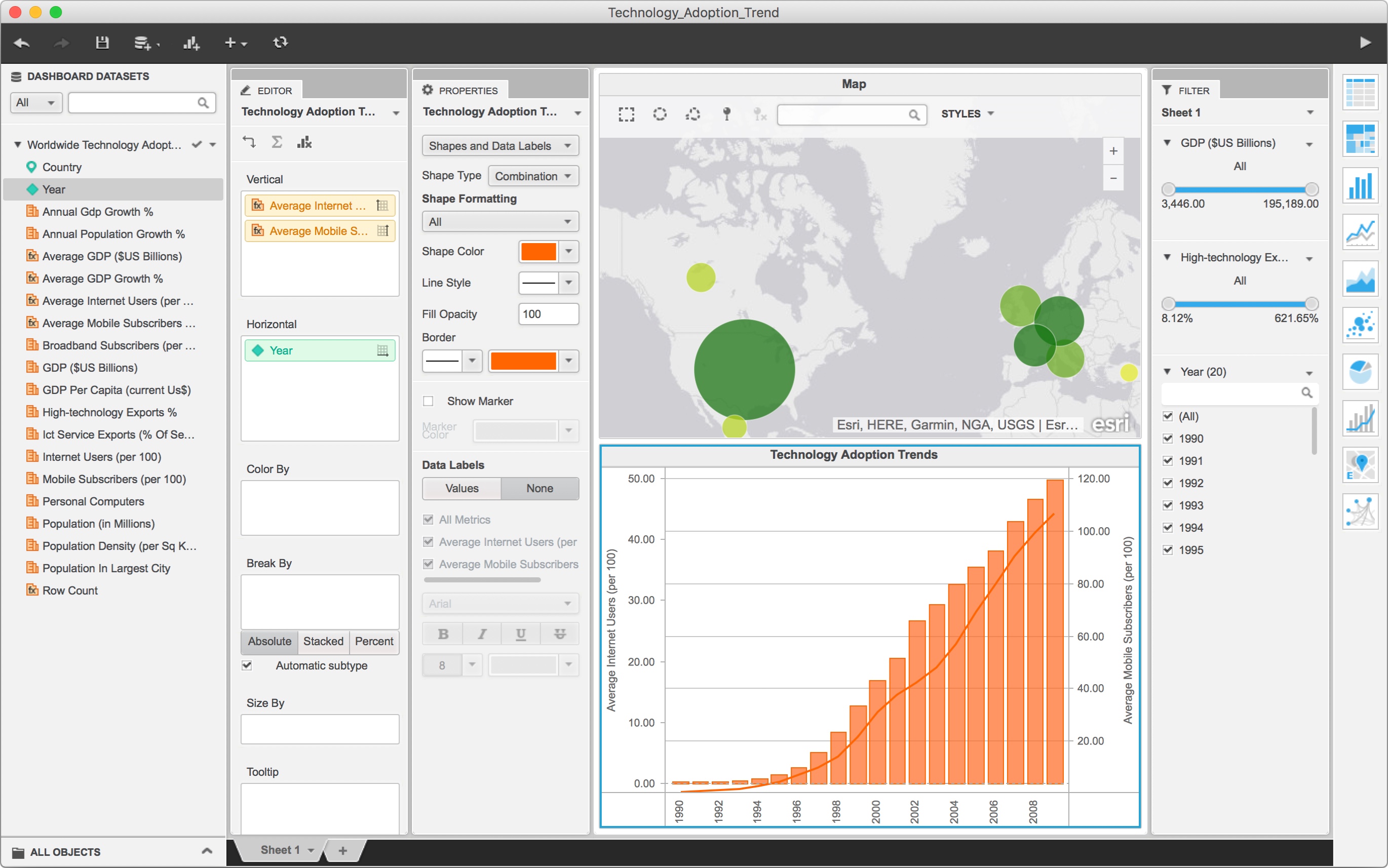
A powerful PROPERTIES panel is available for the power user. It is not shown on the interface by default, but it can be opened with one click. Users can reorganize the placement of each control panels. Following example shows EDITOR and PROPERTIES panels docked side by side, and FILTER panel placed at the very right side of the screen.
Final design
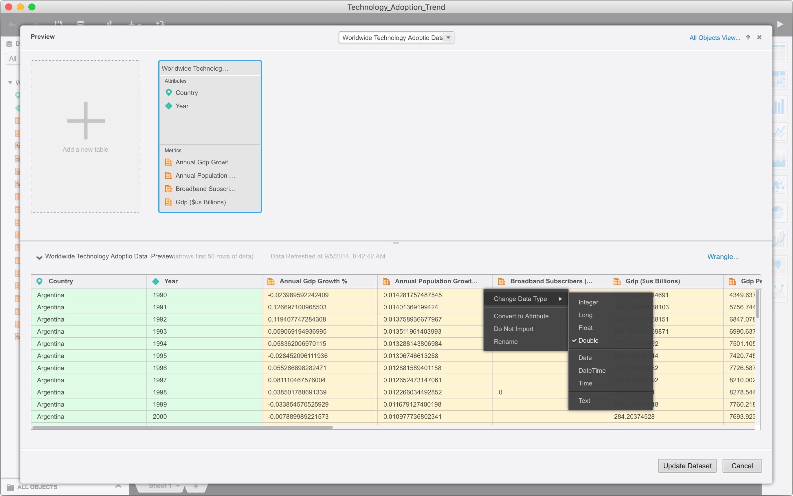
Data import interface
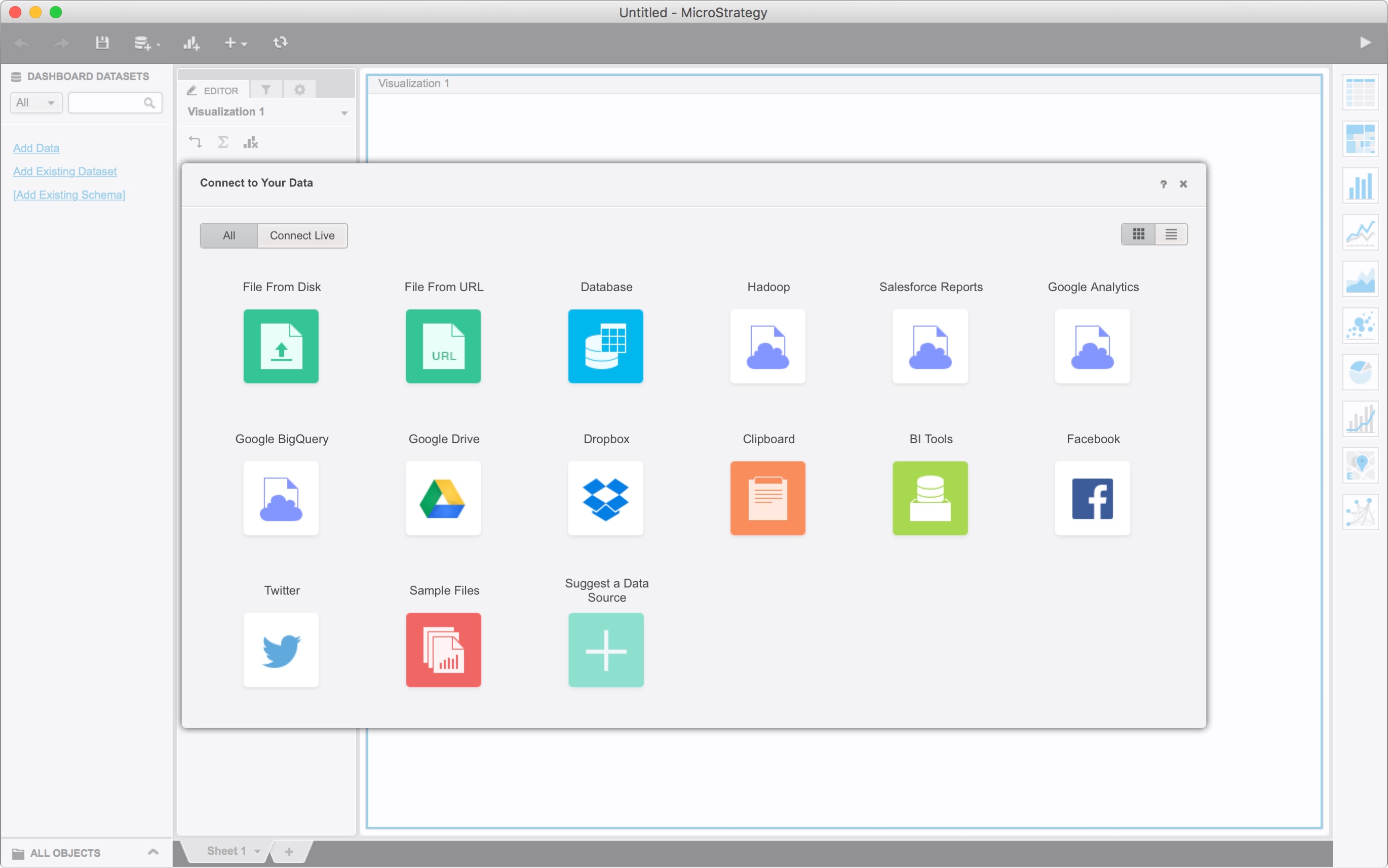
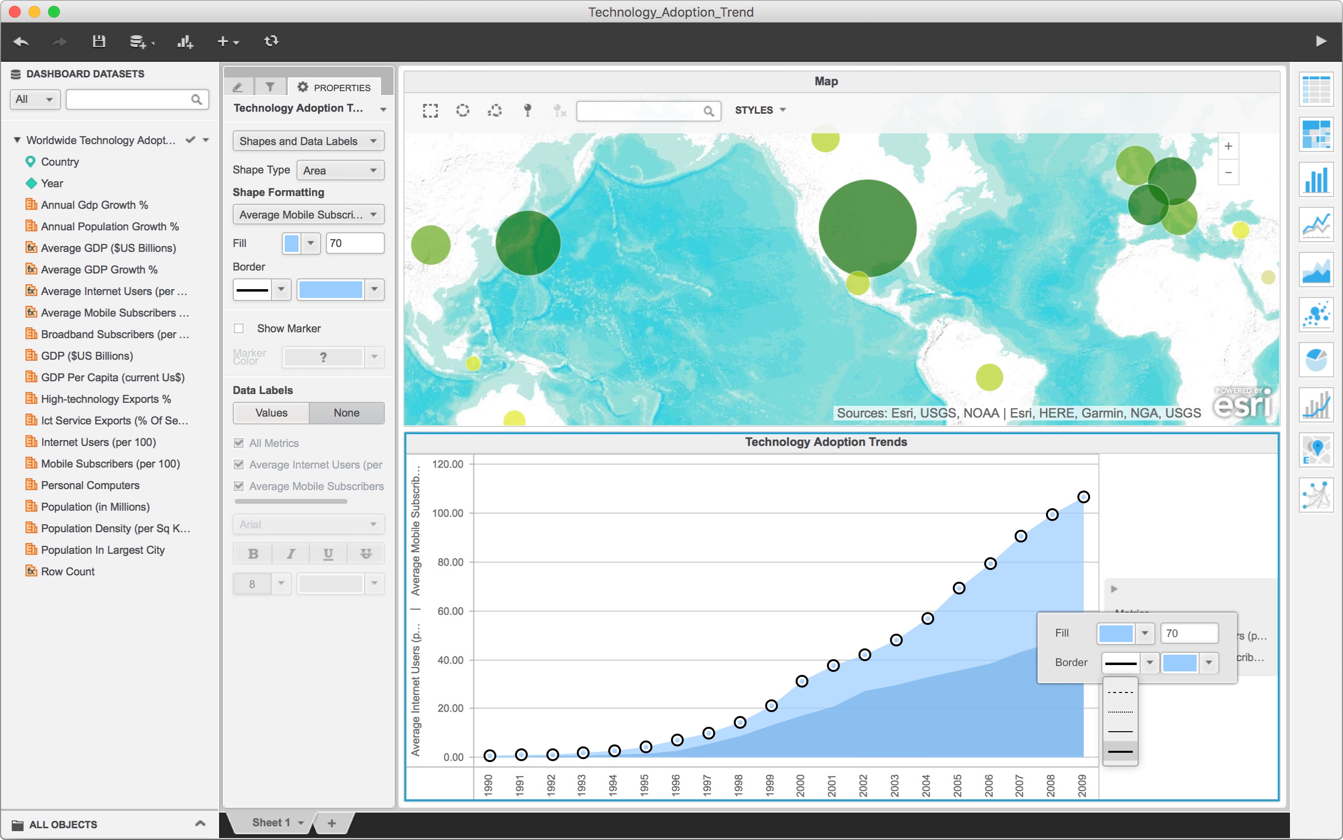
Main interface
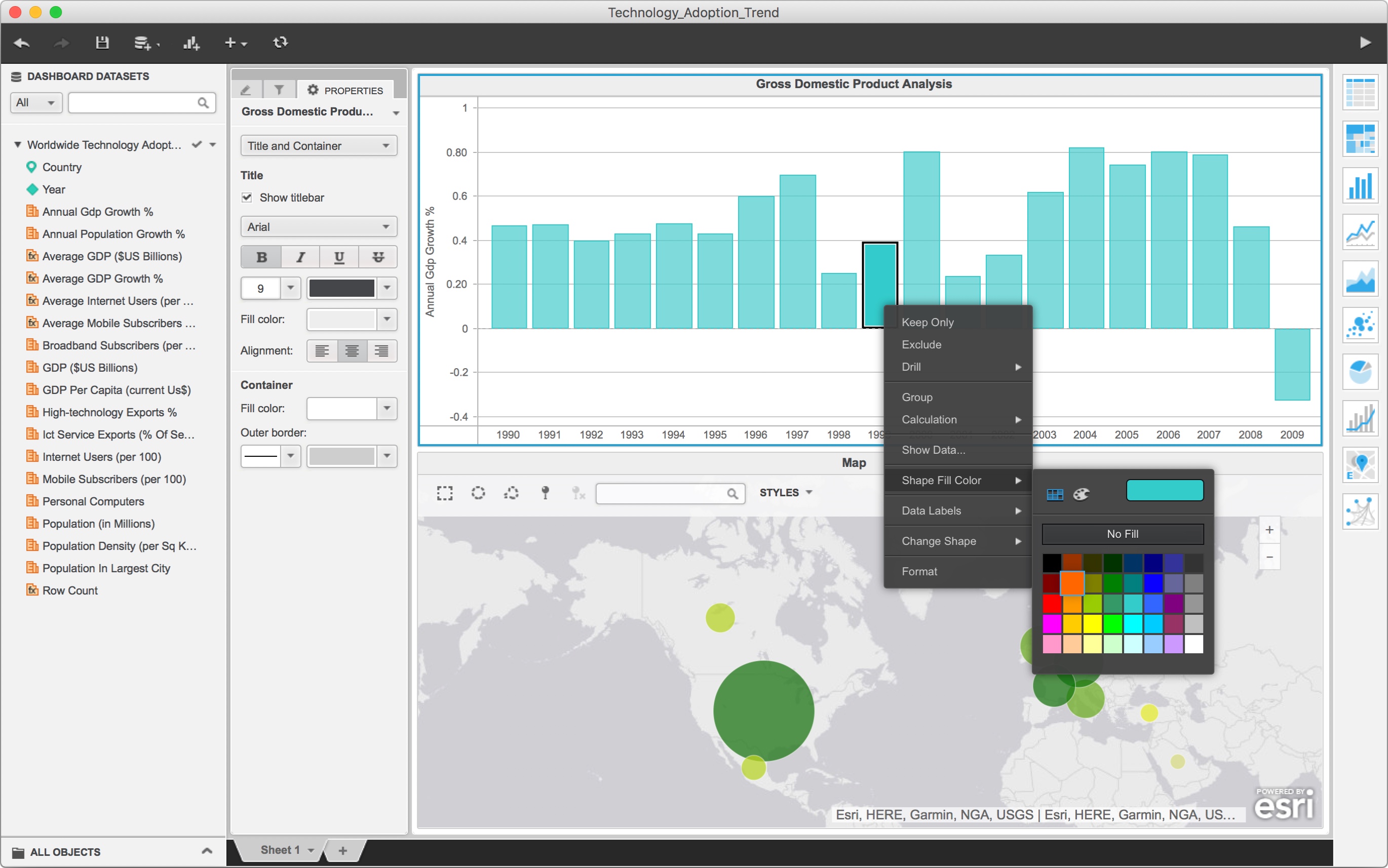
Inline editing feature
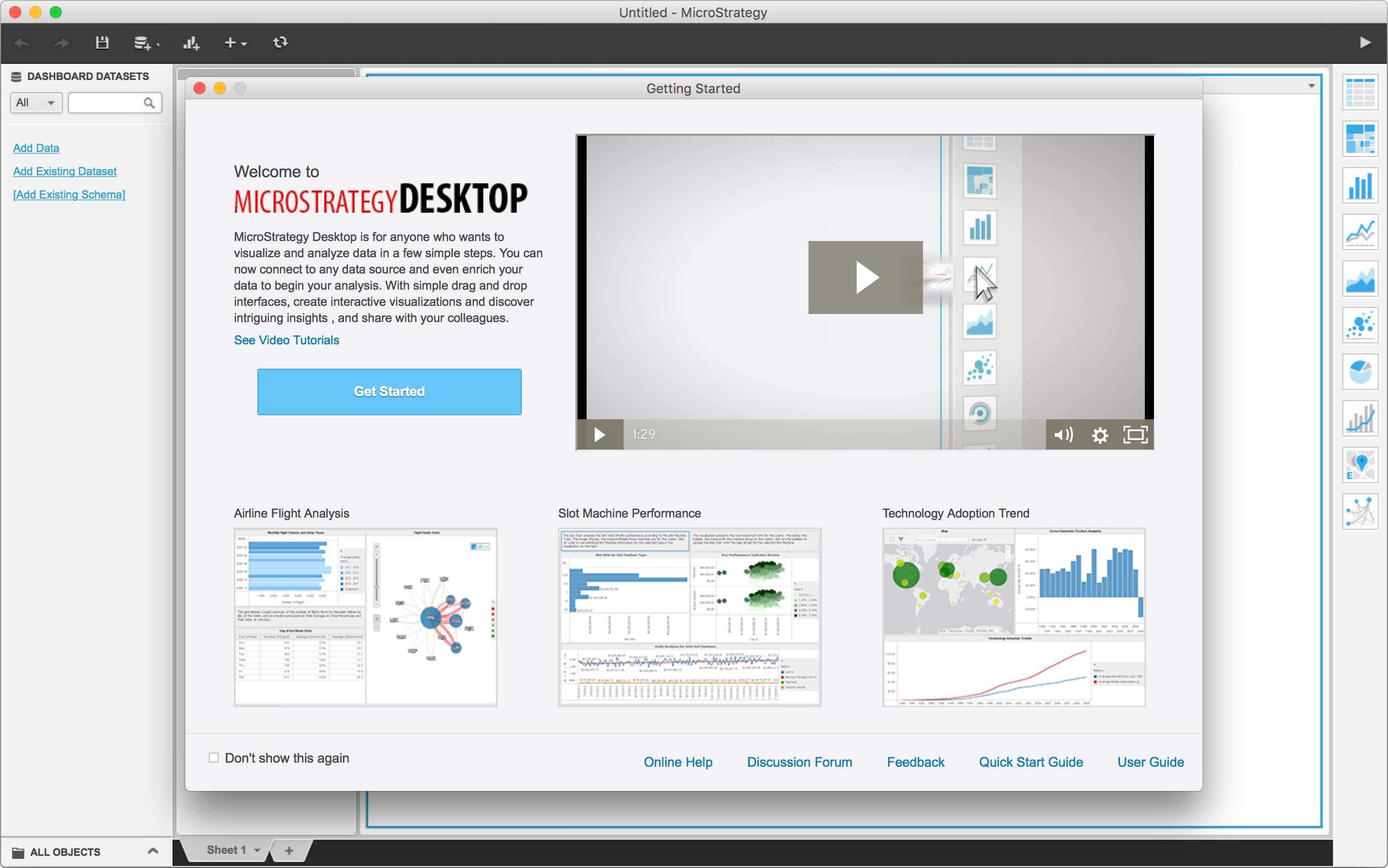
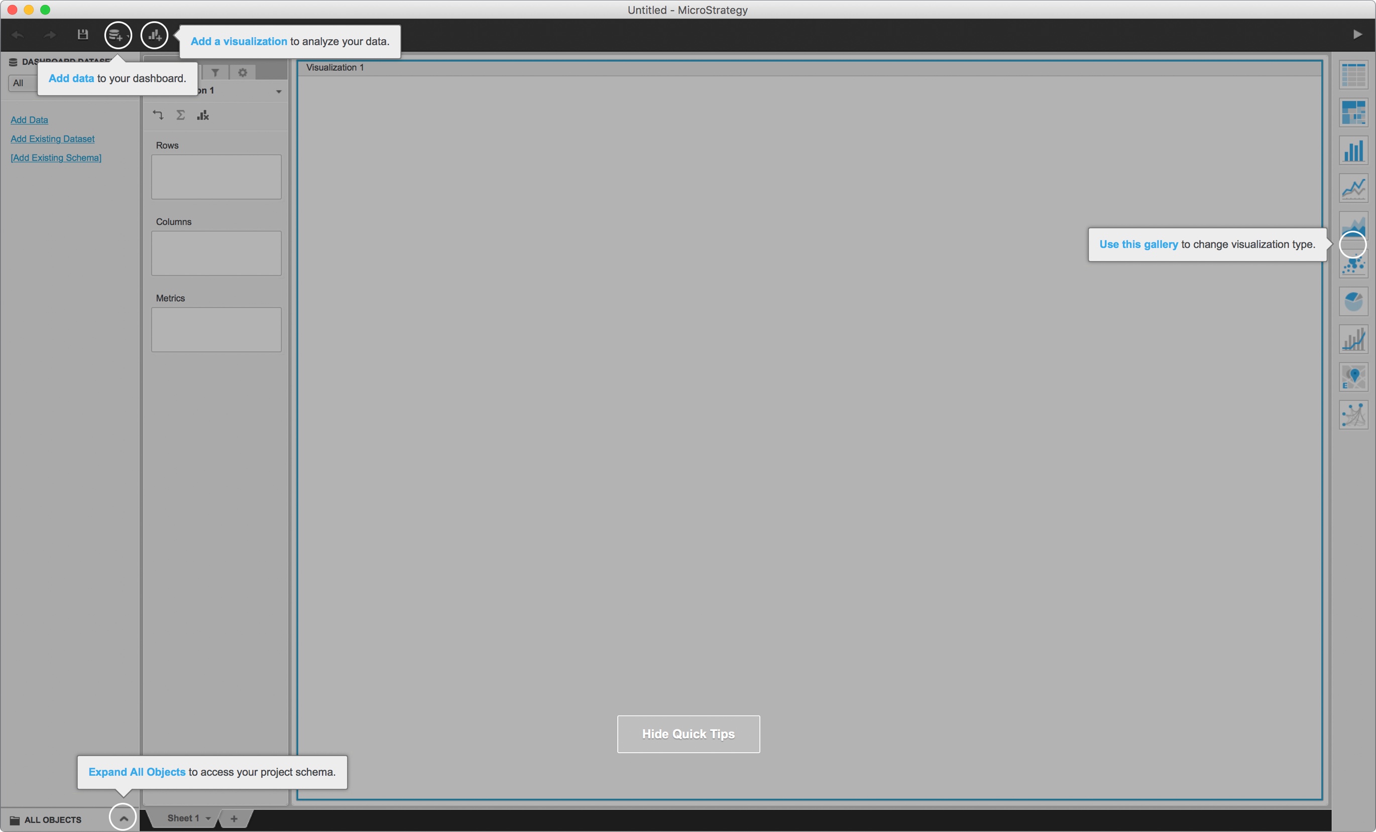
First time user experience
First-time user experience is the part that we tried to cut costs. We were approaching the deadline when working on it. Therefore, we came up with this design that does not require too much development effort, while also helped users to get on board.
